
The rise of mobile shopping has changed the way sellers need to approach Amazon product listings. More than half of Amazon’s shoppers browse and buy through their smartphones, which means that your listings must be formatted, written, and designed to perform well on smaller screens. If your Amazon product title, images, or bullet points are not optimized for mobile display, you may be missing a large share of potential sales.
To perform well on mobile, an Amazon listing should not only look appealing but must also load quickly, display essential details upfront, and help the buyer make a decision without excessive scrolling. This guide will walk you through the detailed process of optimizing your Amazon listings for mobile users. It will also explain mobile behavior patterns, design practices, and how Amazon’s mobile algorithm differs from desktop search.
For brands seeking expert help with end-to-end optimization, services like Amazon ecommerce solutions can support product listing strategies that align with mobile-first indexing and conversion-focused SEO.
Understanding How Amazon Displays Listings on Mobile
Amazon’s mobile interface is built to minimize clutter and prioritize key purchase signals. When users search on the Amazon app, they see truncated titles, limited bullet points, and smaller images than on desktop. This is why sellers who only optimize for desktop listings often notice lower engagement rates on mobile.
Here’s a simple breakdown of what appears first to a mobile shopper:
| Element | Visibility on Mobile | Best Practices |
| Product Title | Truncated after ~80 characters | Place the most important keywords and value first |
| Primary Image | Small but highly visible | Use bright, high-quality images that stand out |
| Bullet Points | Often collapsed; first 2-3 matter most | Keep each point under 200 characters |
| Description | Hidden below fold | Summarize benefits early |
| A+ Content | Mobile-friendly version displayed | Design in modular format and test on various screens |
The lesson here is that mobile users engage mainly with the title, the first image, and the first few bullet points. Every word counts, especially at the top of your listing.
The Role of Mobile Shopping Behavior on Amazon
Mobile users have shorter attention spans and less patience for long paragraphs or unclear images. According to behavioral data, most mobile buyers make decisions based on three core cues: trust, clarity, and speed. They want to know what the product does, what makes it better, and if it’s available now.
A mobile shopper’s journey usually looks like this:
- Quick search on Amazon app.
- Skims titles and images.
- Clicks the most relevant and visually appealing result.
- Reads a few bullet points or short reviews.
- Adds to cart or moves on within seconds.
Your listing should fit that flow. A cluttered layout, confusing title, or missing keyword can interrupt the buying decision.
Optimizing the Product Title for Amazon Mobile Users
Amazon product title optimization for mobile is not about writing longer titles. In fact, short, keyword-focused titles perform better because mobile screens show roughly 70–80 characters before truncation. Avoid stuffing your title with unnecessary phrases or brand names.
Best Practices for Mobile-Friendly Amazon Titles:
- Put the main keyword at the start (example: “Stainless Steel Water Bottle – 32 oz Insulated Leakproof”).
- Include one or two product-defining features only.
- Avoid filler terms like “premium,” “best,” or “top-rated.”
- Follow Amazon’s category-specific title guidelines.
- Test visibility by previewing the title on mobile before publishing.
If you sell across multiple categories, you can seek assistance from Maxim Blu’s product listing services for keyword research and structured copywriting suited for Amazon’s mobile layout.
Writing Bullet Points That Work on Mobile Screens
Amazon bullet points often determine whether users scroll further or not. On mobile, only the first few lines of bullet points are visible, and users must expand to view more. That means your first two bullet points should communicate the most powerful benefits.
Tips to Optimize Bullet Points for Amazon Mobile:
- Keep them under 200 characters each.
- Focus on one idea per bullet.
- Start with an action word (e.g., “Designed for,” “Made with,” “Built to”).
- Use line breaks only if essential.
- Avoid repetitive phrases that waste vertical space.
Example (Poor Mobile Version):
“High quality premium stainless steel water bottle with double wall insulation that keeps drinks hot or cold for a long time.”
Improved Mobile Version:
“Double-wall insulated stainless steel bottle keeps drinks cold for 24 hours or hot for 12.”
Shorter, direct, and clearer – that’s the mobile rule.
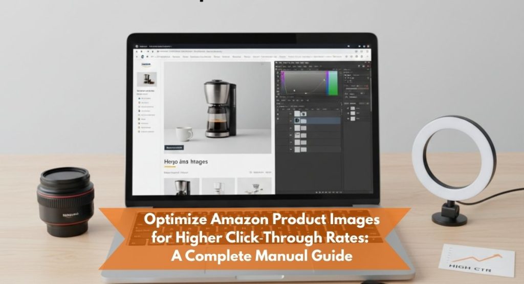
Optimizing Amazon Product Images for Mobile Display
Images dominate the mobile user’s attention. Most users decide to click or not based solely on the first product image. Amazon allows up to nine images, but on mobile, the first two get the most visibility.
Mobile-First Image Optimization Checklist:
- Use square images (1:1 ratio) with at least 2000×2000 pixels.
- Keep the background white for the main image.
- Add infographics to highlight features (ensure readable text).
- Include a lifestyle image showing product use.
- Compress images for faster loading times.
If you struggle with image rendering or quality, Our web design team can help craft image layouts optimized for both mobile and desktop conversions.
Product Descriptions that Convert on Mobile
Amazon product descriptions appear much lower on the mobile product page, which means few people read them unless they’re already interested. Still, a well-written mobile description strengthens the final buying decision.
Best Practices for Mobile-Friendly Product Descriptions:
- Write short, 2–3 line paragraphs.
- Use HTML formatting sparingly ( for line breaks, for emphasis).
- Summarize main features early.
- Highlight unique value, warranty, or certifications.
- Include mobile-friendly keywords naturally (for example: “Amazon listing mobile friendly,” “mobile user experience Amazon product page”).
To ensure consistent tone and clarity, brands often rely on professional product copywriting like our copywriting services, which focus on persuasive, clear, and concise content that appeals to mobile shoppers.
A+ Content and Enhanced Brand Content for Mobile
Amazon A+ Content looks different on mobile than desktop. The modules appear stacked vertically and images often resize automatically. That means the design must be flexible and easily readable without zooming.
Guidelines for Mobile A+ Content:
- Avoid text-heavy graphics.
- Use modular blocks with 1-2 sentences each.
- Optimize infographics for portrait orientation.
- Test the mobile preview before publishing.
- Keep fonts large enough to read comfortably on 5-inch screens.
Mobile A+ content should be visual, short, and benefit-driven rather than storytelling-focused.
Mobile SEO for Amazon Listings
Amazon’s mobile search algorithm considers similar ranking signals as desktop (keywords, conversion rate, CTR, reviews) but with an extra emphasis on click-through and mobile engagement metrics. The faster users click and stay on your page, the better the algorithm interprets your relevance.
Mobile SEO Optimization Techniques:
- Front-load keywords in the title.
- Add relevant secondary terms in bullet points.
- Optimize backend search terms for long-tail mobile queries.
- Test loading speed of product images.
- Track mobile conversion rates separately using Brand Analytics.
If you’re building a multi-channel SEO plan that includes Amazon, you can align your product optimization with our SEO marketing strategies to balance keyword intent with conversion-focused design.
Mobile vs. Desktop Amazon Listing Comparison
| Feature | Desktop | Mobile |
| Title Length Visible | ~200 characters | ~80 characters |
| Image Size | Larger with zoom | Smaller; no hover zoom |
| Bullet Points | Fully visible | Partially hidden |
| Description | Easily accessible | Hidden below fold |
| A+ Content | Wide format | Stacked vertically |
| Add to Cart | Always visible | Hidden until scrolled |
Understanding these layout differences helps you prioritize what information to show first. Always preview your listing on both mobile and desktop before finalizing.
Common Mistakes in Amazon Mobile Listing Optimization
Even experienced sellers make mistakes when adapting listings for mobile users. Avoid these pitfalls:
- Overlong Titles: Long titles look cluttered and get cut off on mobile search results.
- Tiny Text in Images: Infographics with small fonts become unreadable.
- Bulky Paragraphs: Mobile users skip dense text.
- Slow-Loading Media: High-resolution images without compression hurt load times.
- Ignoring A/B Testing: Testing different formats helps identify what mobile users respond to best.
How to Test Your Listing’s Mobile Performance
Amazon doesn’t yet offer a built-in mobile preview for listings. However, you can simulate it in two ways:
- Use the Amazon App: Search your product manually and observe how the title and bullet points appear.
- Browser Device Mode: On Chrome, right-click > Inspect > Toggle device toolbar to see mobile preview.
Monitor metrics like click-through rate, add-to-cart rate, and conversions. Compare mobile and desktop data separately using Amazon Brand Analytics or third-party tools.
Improving Mobile Conversion Rate
Optimizing for clicks is only half the battle. You also need to improve the mobile conversion rate once users land on your product page.
Steps to Increase Mobile Conversion:
- Place trust signals near the top (certifications, warranty).
- Add lifestyle images showing the product in use.
- Keep price and shipping visible without much scrolling.
- Use short, confidence-building reviews in your main gallery if eligible.
- Run limited-time deals to create urgency.
Integrating Mobile Optimization into Overall Ecommerce Strategy
Your Amazon mobile strategy should fit into a broader ecommerce framework. As consumer behavior shifts toward mobile-first browsing, even your website and ads should be designed with similar principles. Working with experienced ecommerce developers, like those specializing in Shopify web development, ensures consistency in mobile UX across all sales channels.
Checklist: Amazon Mobile Listing Optimization Summary
- Title under 80 characters with key terms upfront
- First image 2000×2000, white background
- Bullet points concise (under 200 characters)
- Mobile-friendly description written
- A+ content optimized for vertical stacking
- Mobile CTR and conversion tracked
Using this checklist helps you systematically refine listings and identify missing elements.
FAQs on Amazon Mobile Listing Optimization
Q1: How many words of the product title are visible on Amazon mobile listings?
About 70–80 characters are shown before truncation, depending on the device screen and search query.
Q2: Why do my bullet points look cut off on mobile?
Amazon collapses longer bullet points to save space. Only the first few lines are visible, so place the strongest benefits first.
Q3: Should I create separate listings for mobile and desktop?
No, but design and write your listing to prioritize mobile readability. Amazon uses responsive layouts.
Q4: What image dimensions are best for Amazon mobile?
A square image (1:1 ratio) with 2000×2000 pixels ensures proper zoom and clarity on all devices.
Q5: How can I measure mobile-specific performance?
Use Amazon Brand Analytics to view metrics by device type, or check third-party tools integrated with Seller Central.
Q6: Does A+ Content improve mobile rankings?
Not directly, but it increases engagement, which can indirectly boost your ranking.
Q7: What’s the best way to write product descriptions for mobile?
Keep it short, use line breaks, emphasize benefits early, and avoid long paragraphs.
Q8: Can poor image quality reduce my mobile conversion rate?
Yes. Blurry or low-quality images cause users to lose trust and exit your listing quickly.
Final Thoughts
Optimizing Amazon product listings for mobile users is not just about fitting text into smaller screens. It’s about creating a shopping experience that feels intuitive, fast, and informative. Mobile shoppers make decisions quickly, so your listing must communicate value immediately through visuals and clear wording.
From product title optimization to mobile-friendly A+ content, every element should serve a single goal: to help users make confident purchase decisions on their phones.
If you’re ready to refine your Amazon listings for better mobile visibility, consider working with professionals who specialize in ecommerce optimization. Maxim Blu offers integrated services in Amazon product listings, SEO marketing, and copywriting that help sellers stand out in mobile-first markets. With strategic listing optimization, your brand can reach more buyers where they shop the most—on their phones.